
Patient Admission Platform
Structured admission system to capture all medical data, guide staff, and support lead conversion.
Company: BetterDoc GmbH
Role: Product Designer driving product strategy, research, and interaction design
Timeline: Ongoing (e.g., Jan 2023 – Present)
Team: Cross-functional collaboration with Medical Sciences, Data, Product, Engineering and Patient Care team.
Why this product?
BetterDoc helps patients find the best possible care by managing their cases end-to-end. One key part of this is admitting new cases into the system – a process that can begin via phone calls, partner apps like MedGate, or standard questionnaires.
The existing admission app was outdated, unintuitive, and didn’t support the growing complexity of intake channels. This redesign aimed to create a single platform to guide Patient Care (PC) team members through admission efficiently and reliably.
Key Problems
The old tool:
- Lacked support for multiple intake channels (phone, app, questionnaire)
- Was not user-friendly: confusing navigation and poor visual hierarchy
- Didn’t help PC teams handle partial or missing patient data gracefully
We needed to design a scalable, intuitive admission platform that:
- Guides PC teams conversationally during phone-based admissions
- Helps them see at-a-glance which data is complete, missing, or needs review
- Reduces cognitive load for both PC teams and patients
Discovery and insights
Key insights from stakeholder interviews & audits
- Natural conversation flow matters: PC team members often struggled to keep calls structured because of poor question order.
- Required vs. optional data wasn’t clear: Missing fields would delay case progression.
- Visual feedback missing: No way to see if a section was fully completed or still needed attention.
- Predefined answers help patients remember: Asking for free-text responses led to incomplete or inconsistent data.
User Journey Mapping
We mapped out the ideal PC team workflow:
- Start with payer & insurance info
- Check eligibility for BetterDoc services (payer legitimation)
- Capture patient details & contact person
- Dive into anamnesis (medical history, pain scale, previous treatments)
- Review and complete admission
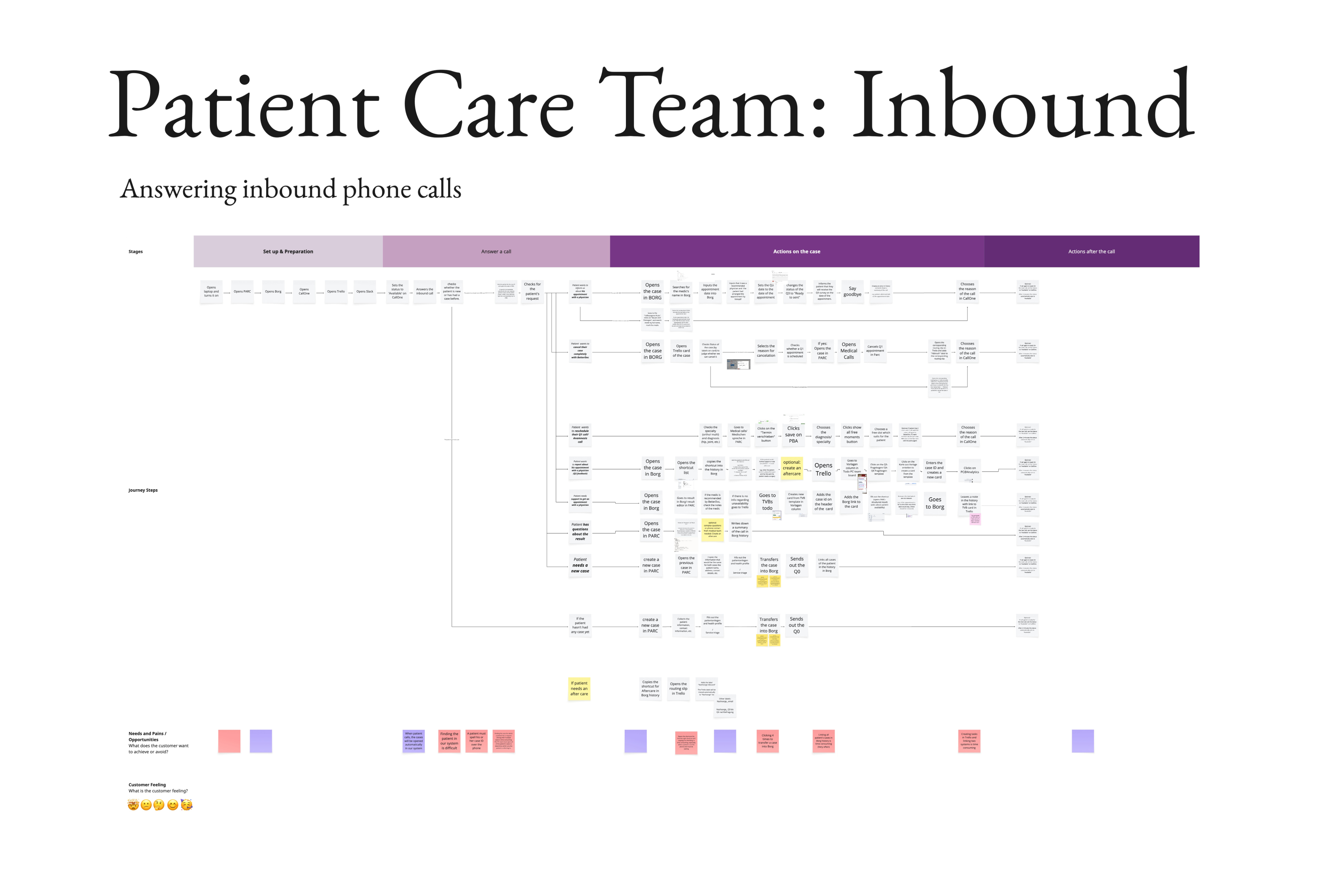
Inbound calls user journey
To identify opportunities and gaps
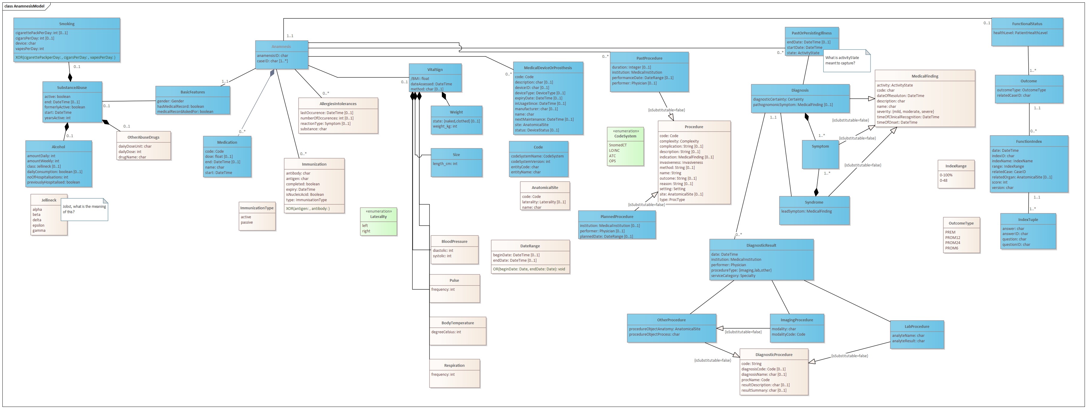
Anamnesis and patient domain model
To inform the information architecture
Design and User Experience
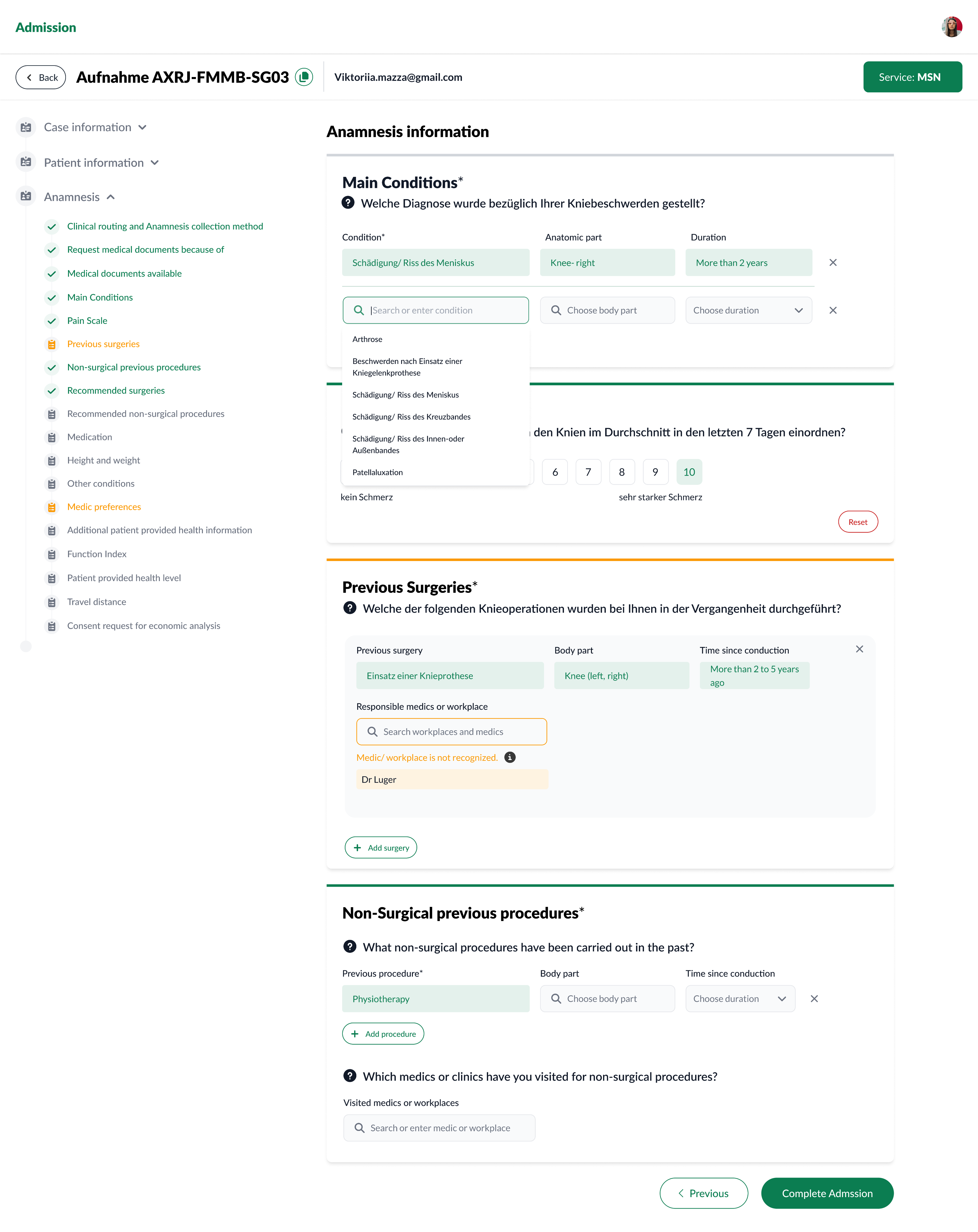
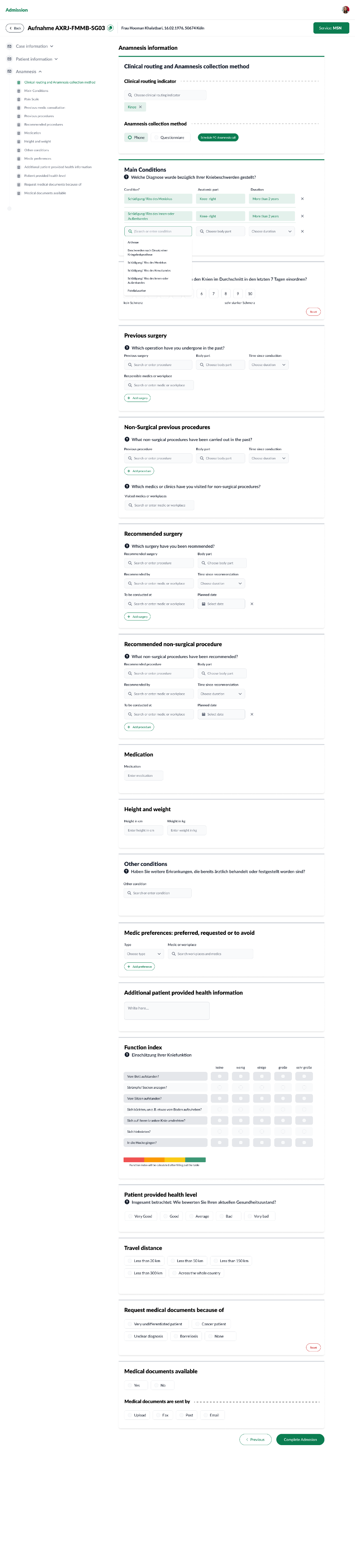
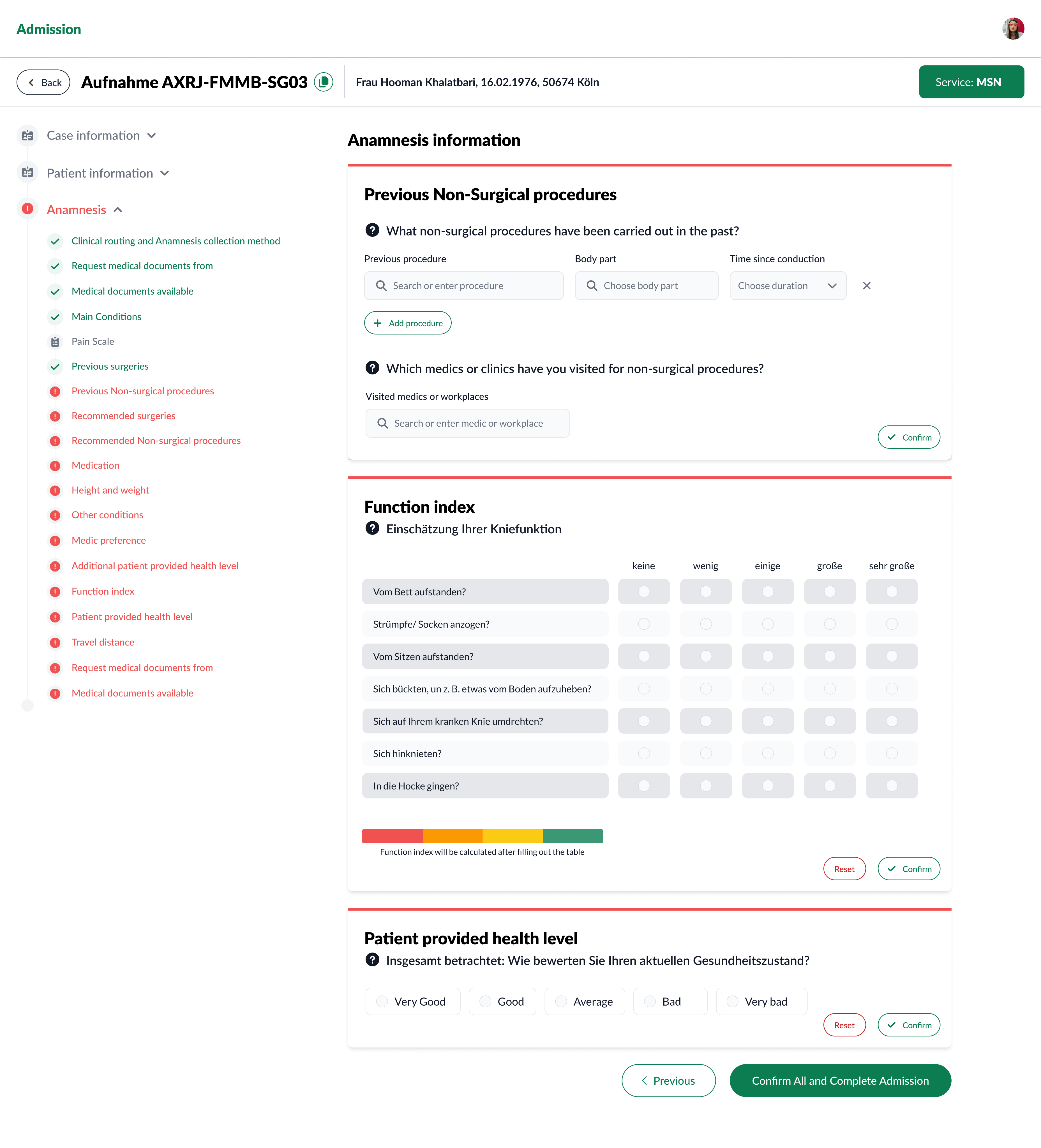
I designed the UI to act as a conversational guide based on the domain model of the case, patient and anamnesis profile:
- Order of Questions: Matches natural call flow
- Conversational Language: Questions written as they’d be asked (e.g., “Wie würden Sie Ihren Schmerz im Durchschnitt in den letzten 7 Tagen einordnen?”)
- Predefined Answer Options: Trigger patient memory and reduce cognitive load
- Required Fields: Clearly marked with asterisks
- Visual States for Data Status:
- ✅ Complete
- ❗ Missing Required Info
- ⬜ Untouched
- ⚠️ Needs Verification
Iterations & Wireframes
- Moved pain scale to its own step → reduced cognitive load
- Added section headers and progress indicators → better call navigation
- Created compact UI for frequent predefined options → faster data entry
Solution overview
Highlights:
- Stepper Navigation: Shows overall progress and data completeness at section and field level
- Visual Cues: Distinct icons/colors for missing, verified, and untouched data
- Conversational UI: PC team members can read questions directly to patients
- Multi-Channel Support: Phone, online leads, or third-party leads
- Comply with new Admission domain models
Outcome
While the tool was in rollout:
- Early feedback from PC teams: “Feels like the system is guiding us, not the other way around.”
- Reduction in missing required fields reported in internal QA checks
- Faster onboarding for new PC team members