
Briefing.works
Empowers agencies and freelancers in clarifying project requirements and providing guidance on what needs clarification, leading to successful delivery.
Company: Sibarg/ Prettylogic GmbH
Role: I led UX for Briefing.works—simplifying complex questionnaires, unifying the design, and introducing a shareable canvas that helps teams agree faster.
Timeline: Apr 2021 to Jun 2022
Team: Cross-functional collaboration with product manager, engineers and graphic designer.
Context
Briefing.works had strong domain expertise but the UX had grown unevenly. Long forms created cognitive load, validation frequently blocked progress, and visual inconsistency reduced trust. Teams also needed a clear way to share and review briefings with clients.
Responsibilities and approach
User research
- Built a primary persona (agency/marketing manager) to anchor decisions.
- Created a customer journey map (awareness → purchase → advocacy).
- Mapped the task-level journey for the core flow: Create & share a briefing.
- Ran a thematic analysis of user feedback to group issues and opportunities.
Product & UX design
- Defined design principles and success criteria.
- Reworked IA and the end-to-end briefing creation experience.
- Added explicit collaboration and sharing touchpoints.
- Shipped a design system for web & mobile (tokens, components, states).
User research
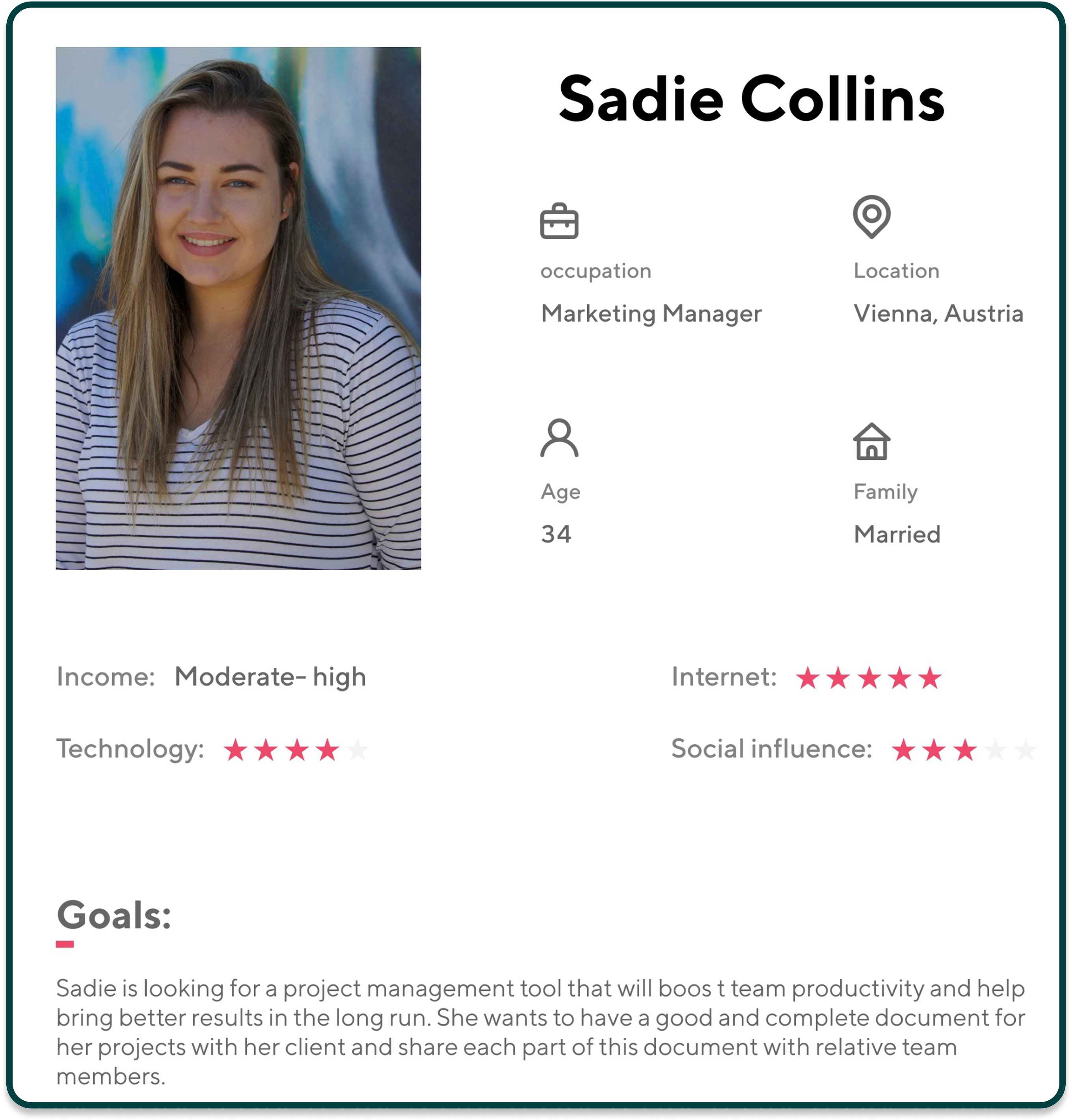
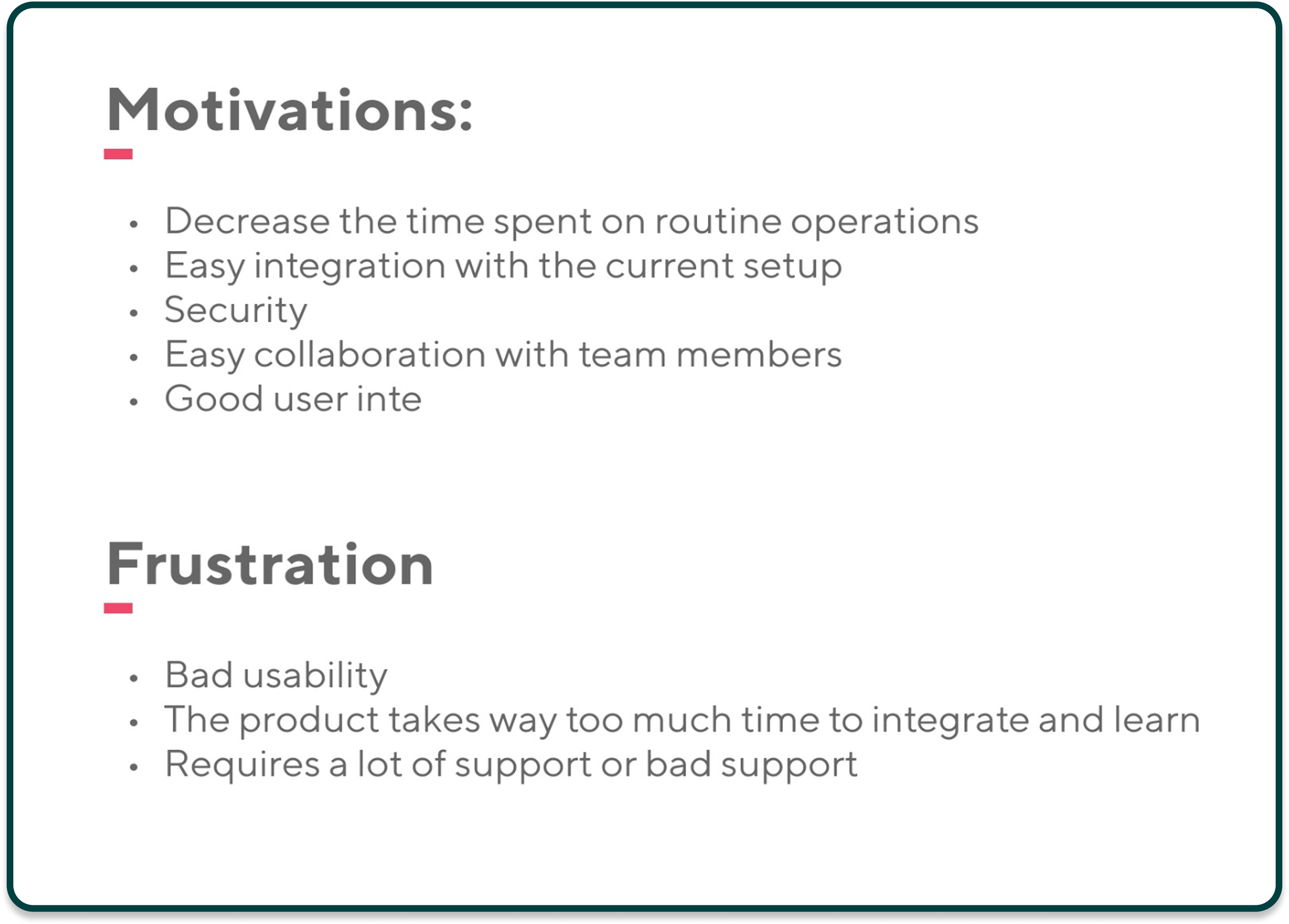
Build a primary persona to highlight core needs, goals, motivations, and frustrations of target users.
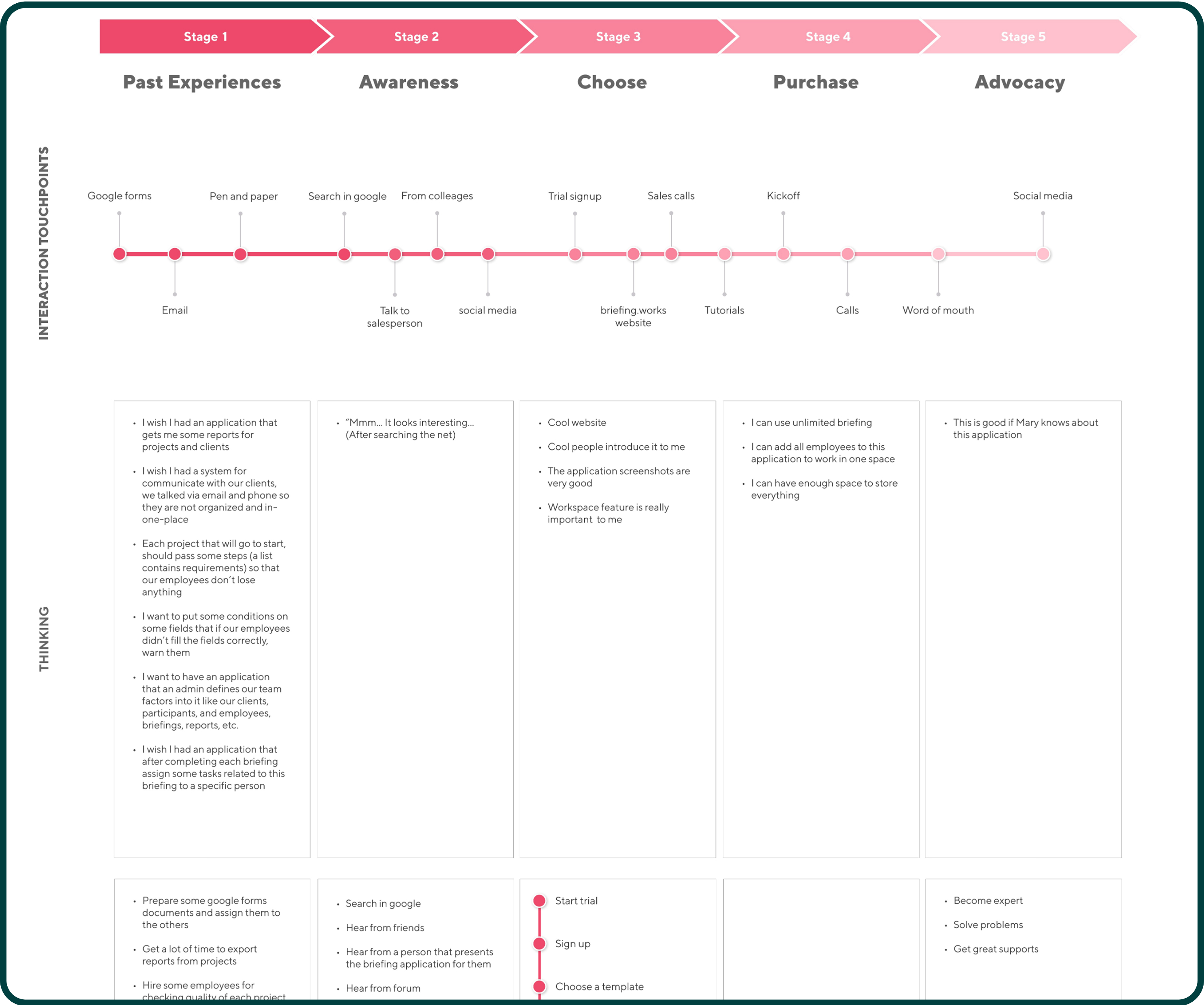
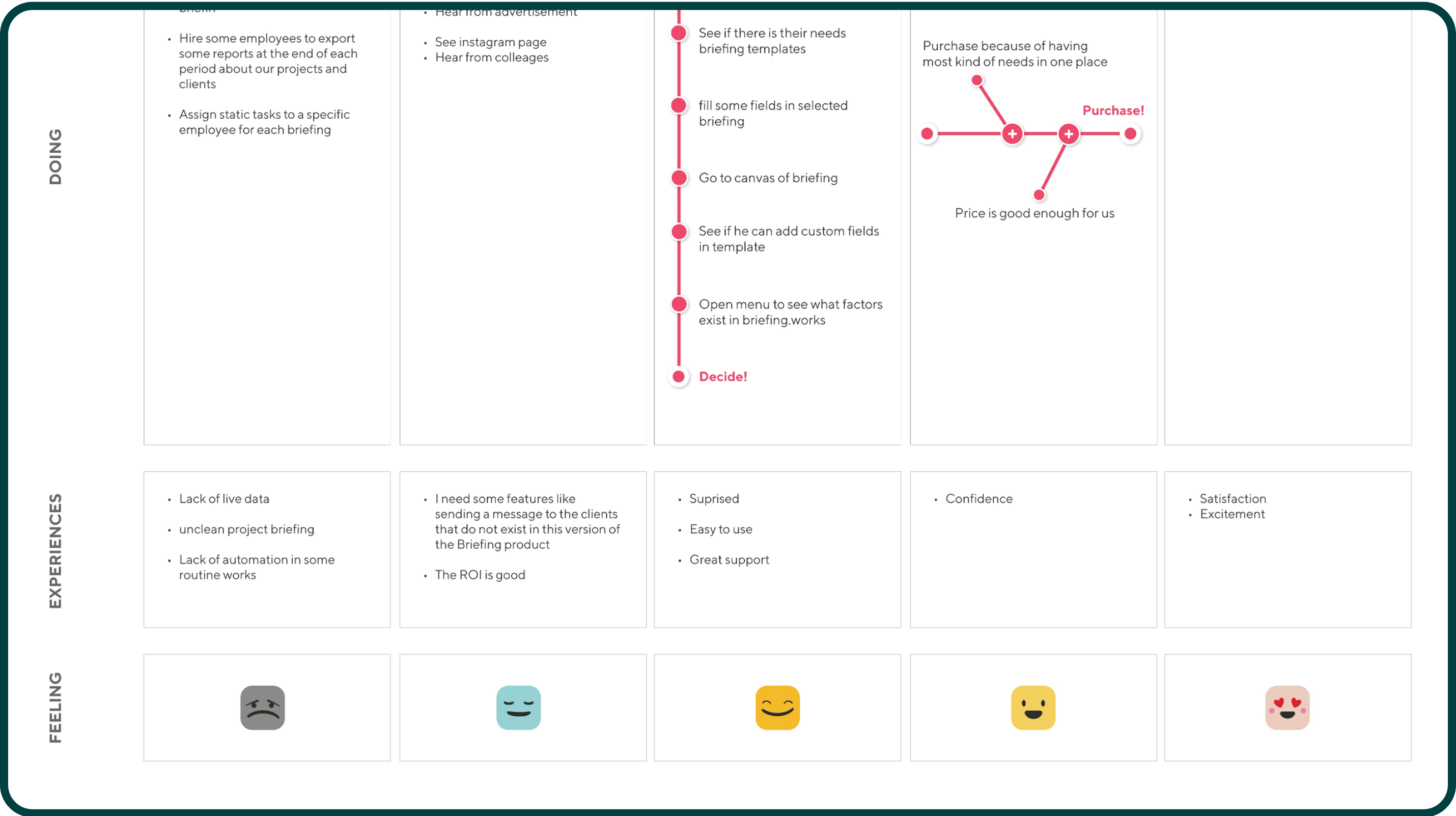
Map the customer journey to highlight key touch points, user actions, emotions, and pain points.
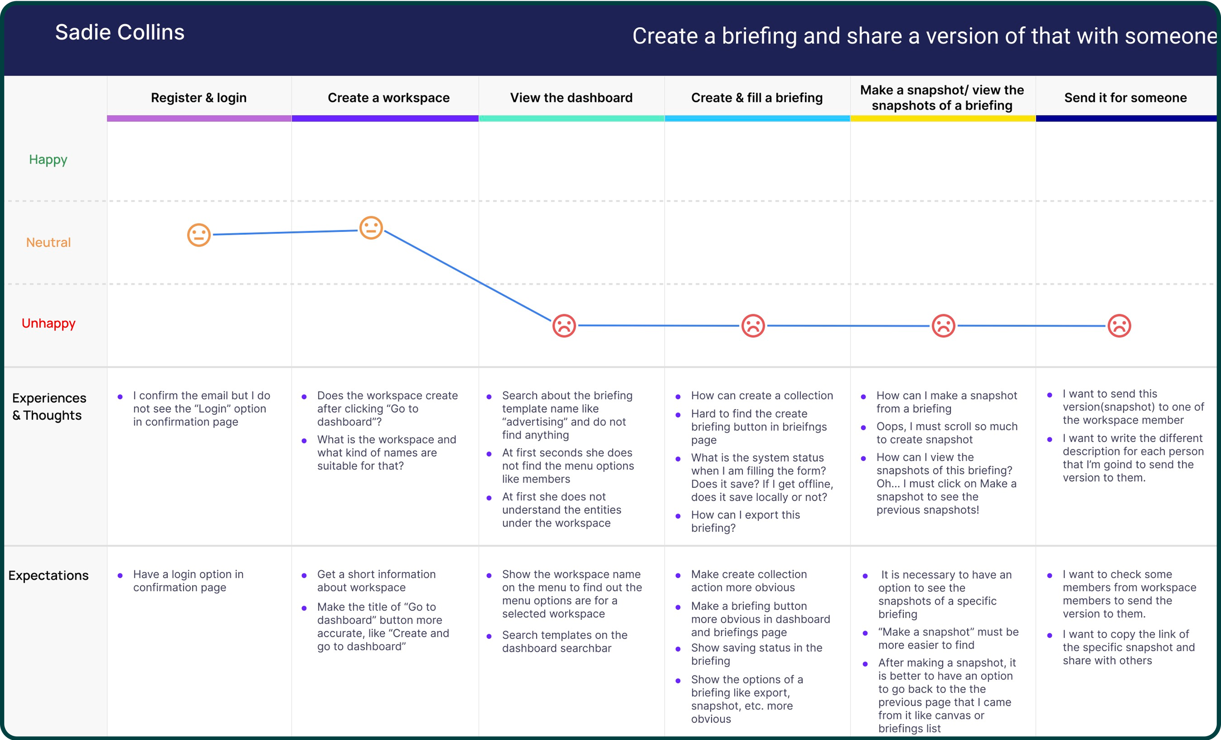
Map the customer journey to highlight key touch points, user actions, emotions, and pain points.
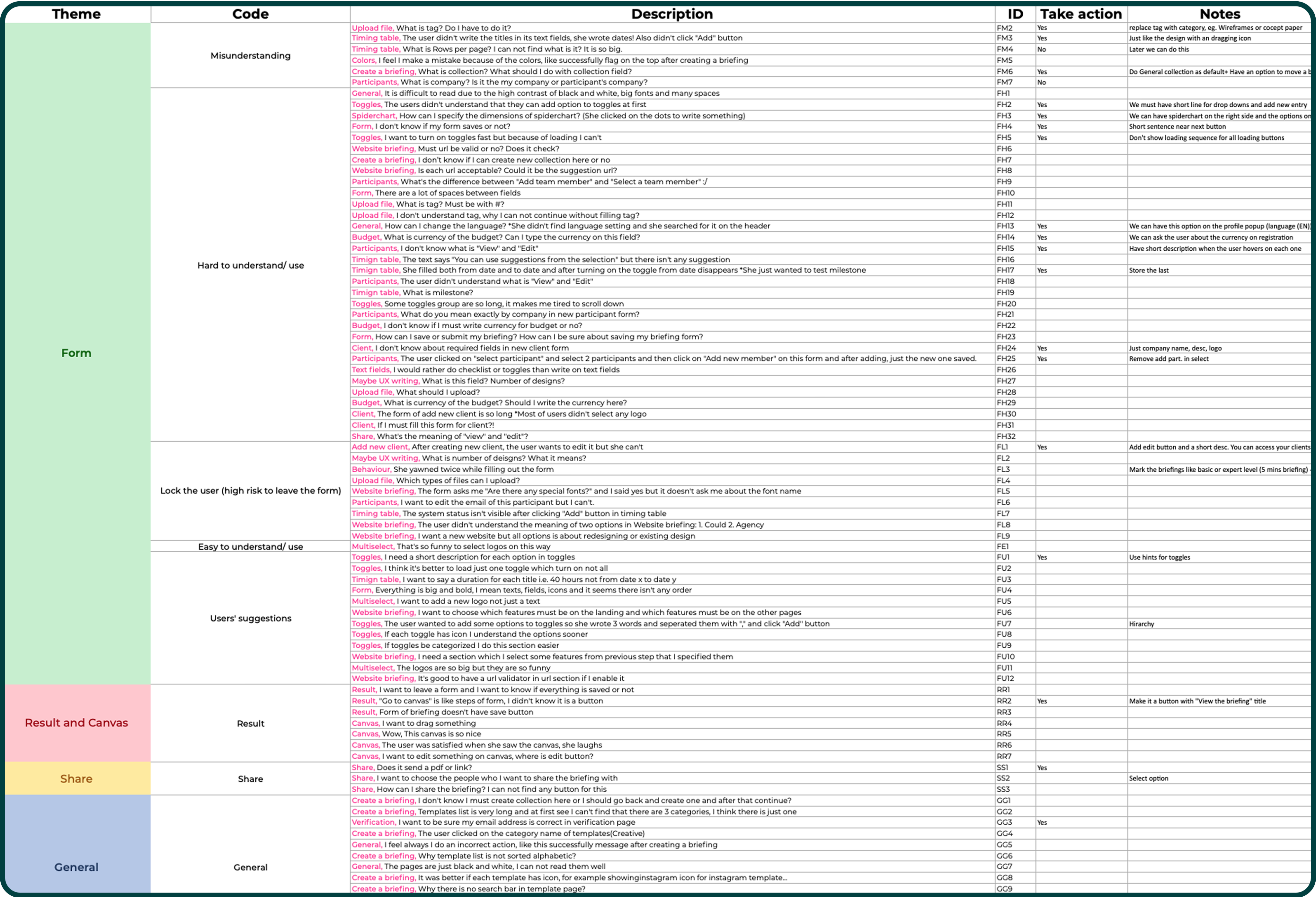
Conduct a thematic analysis: categorize user feedback and collected insights into key themes to identify main problems and needs.
Key Insights
Forms created friction: fields were confusing, groupings unclear, and error handling blocked progress.
Terminology & feedback: users didn’t understand system labels or messages.
High failure risk: common error states stopped users entirely.
Guidance gaps: users asked for simpler steps, better defaults, and a few targeted features.
Design principles and Design system
Clarity without AmbiguitySharp colors, clean shapes, and a restrained visual language. A 4-pt spacing grid, clear hierarchy, and explicit states (focus, error, success) make actions and system feedback unmistakable.
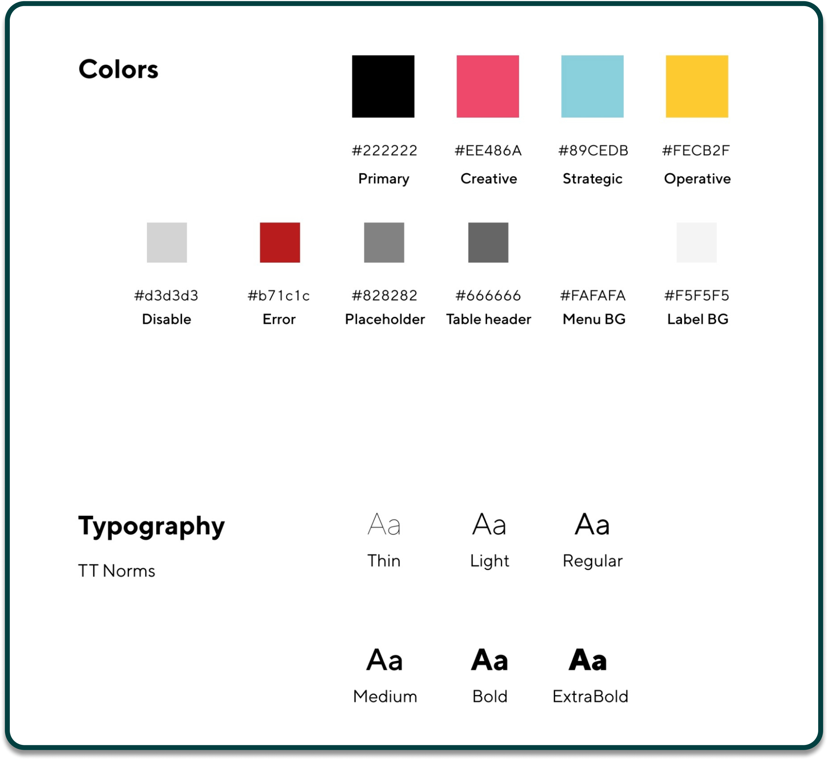
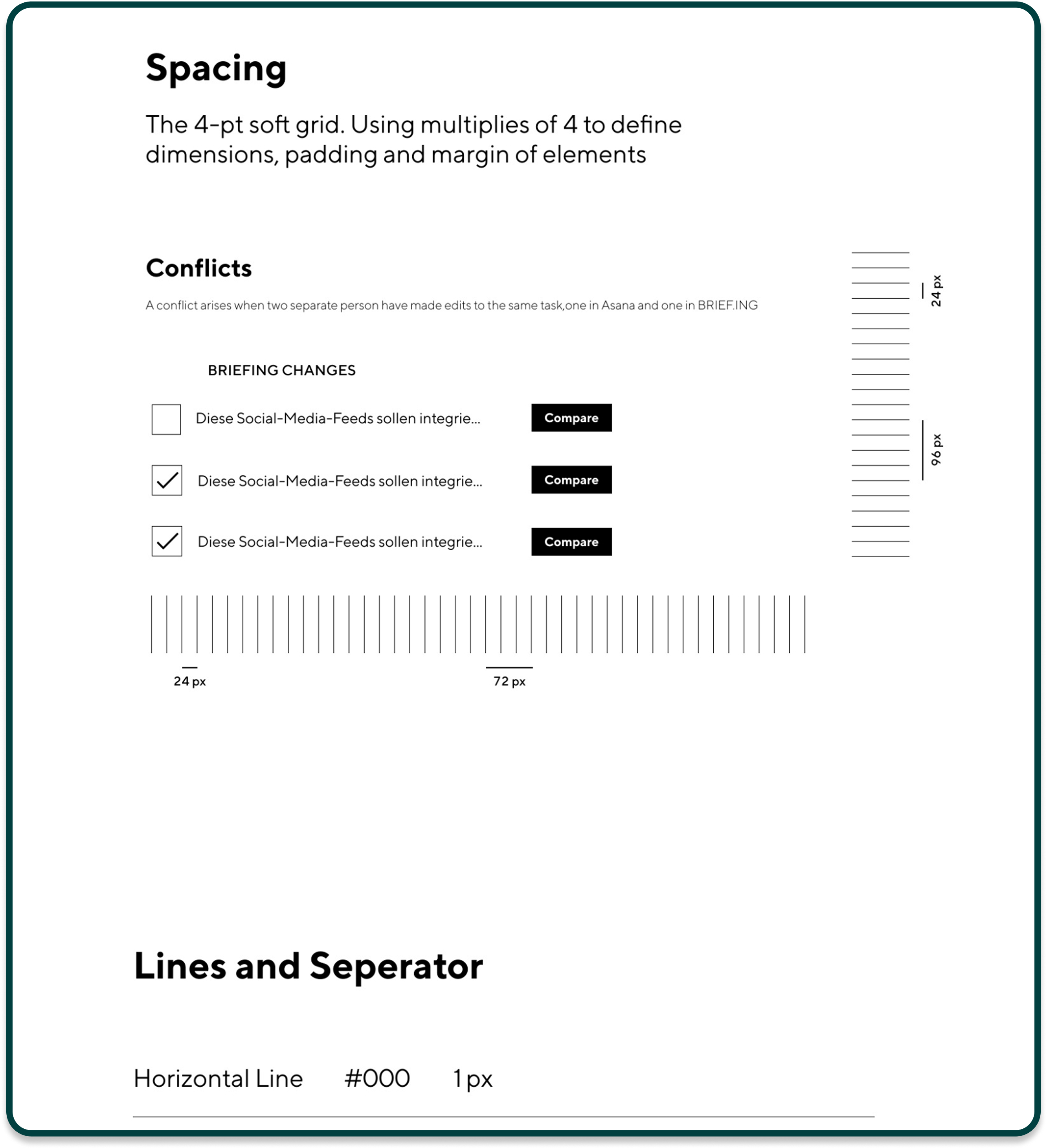
Created a design system to ensure consistency across web and mobile components.
Key product experience highlights
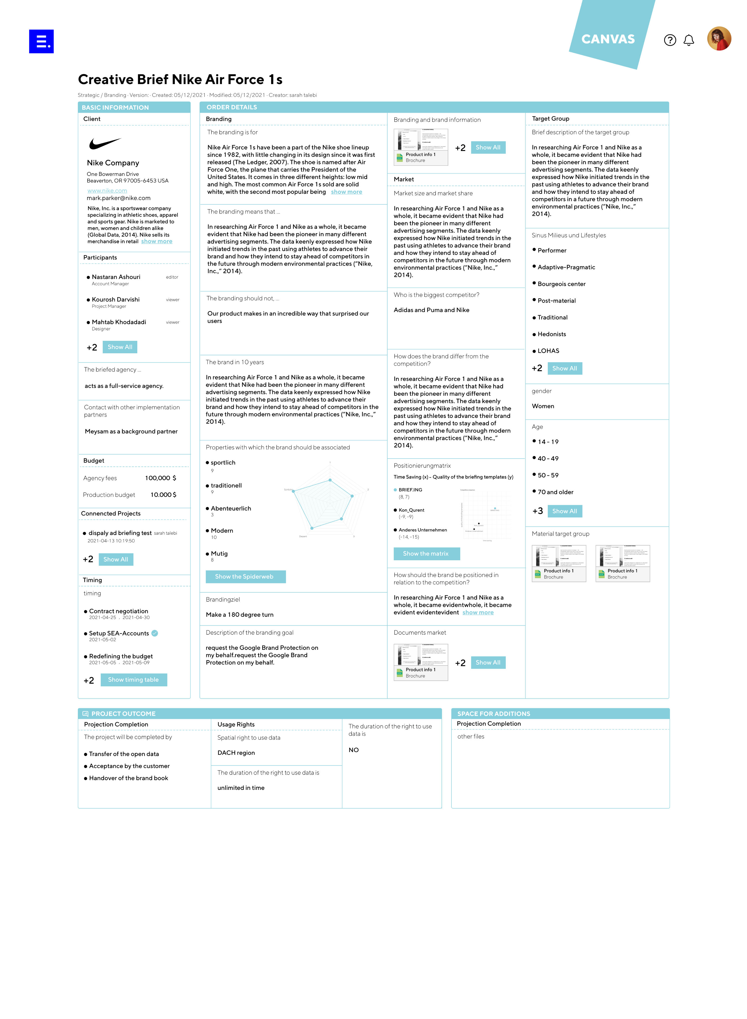
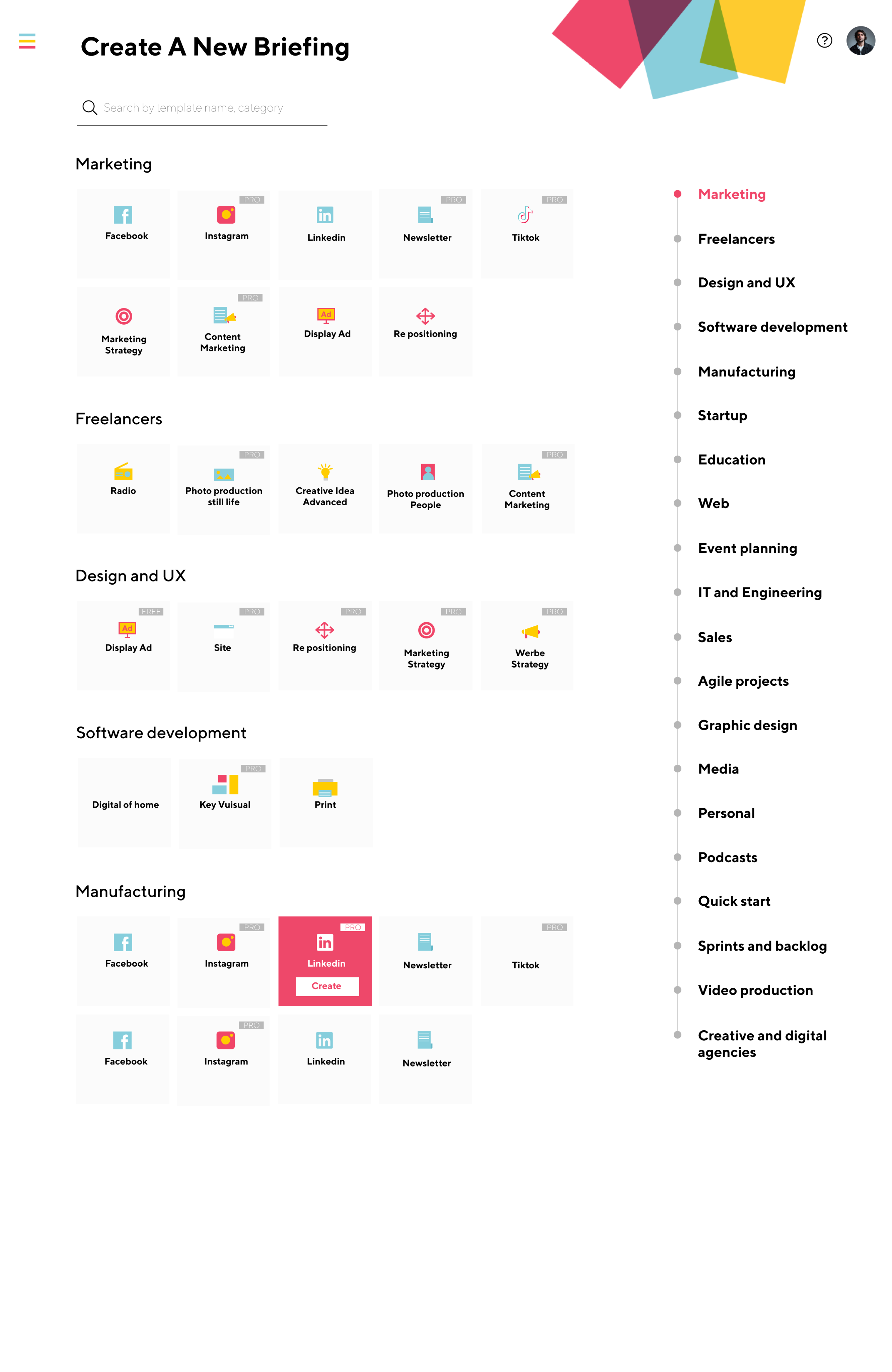
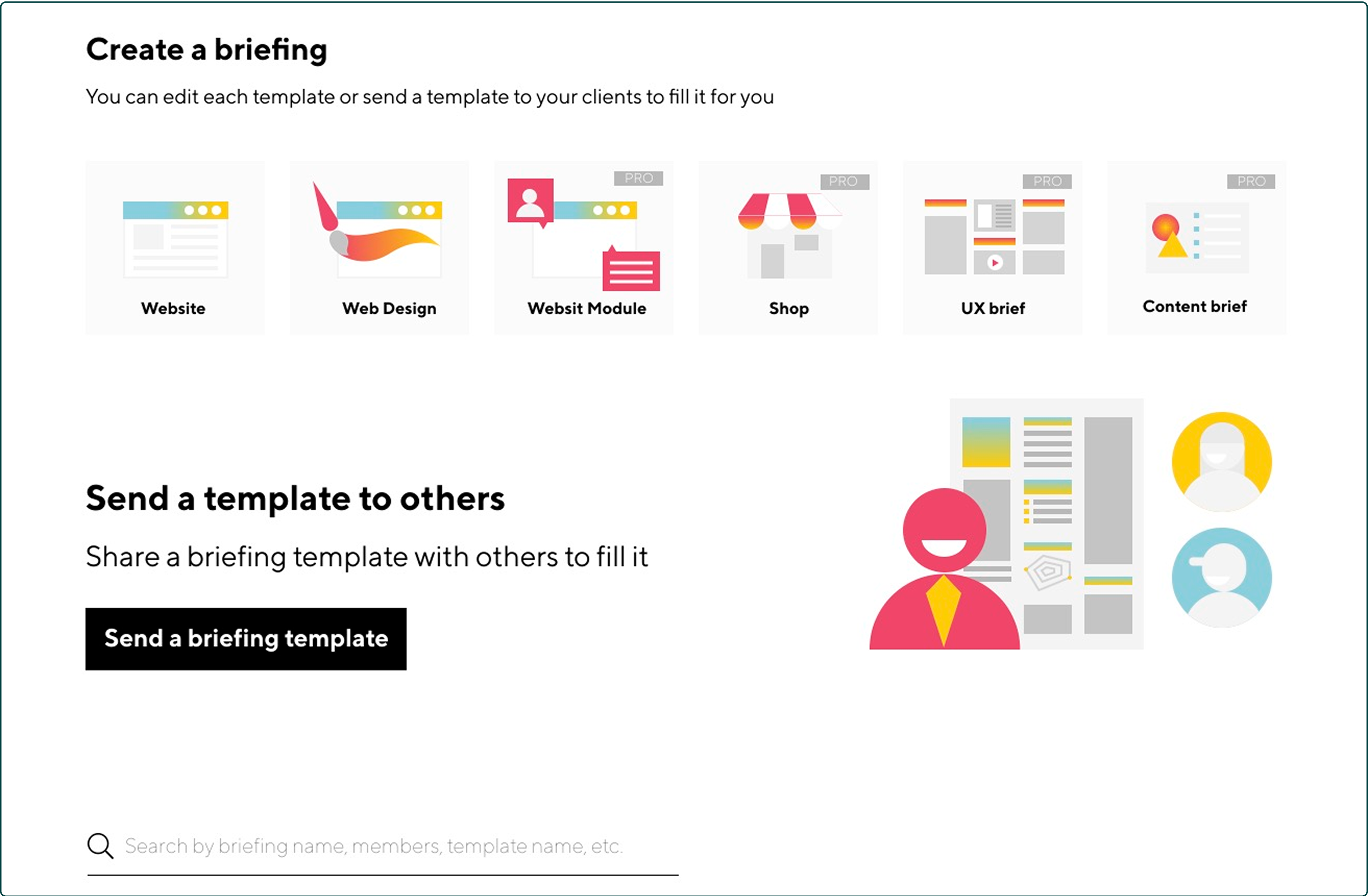
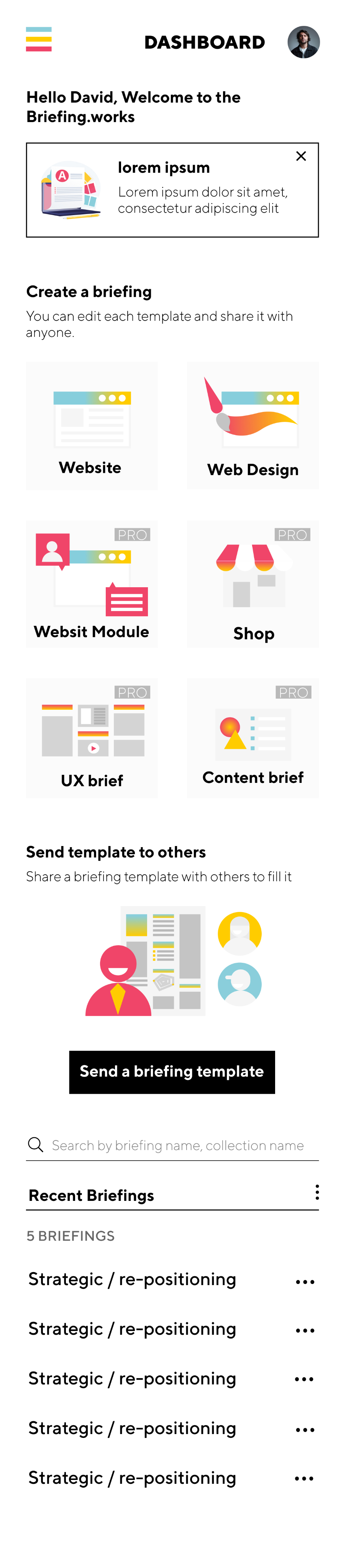
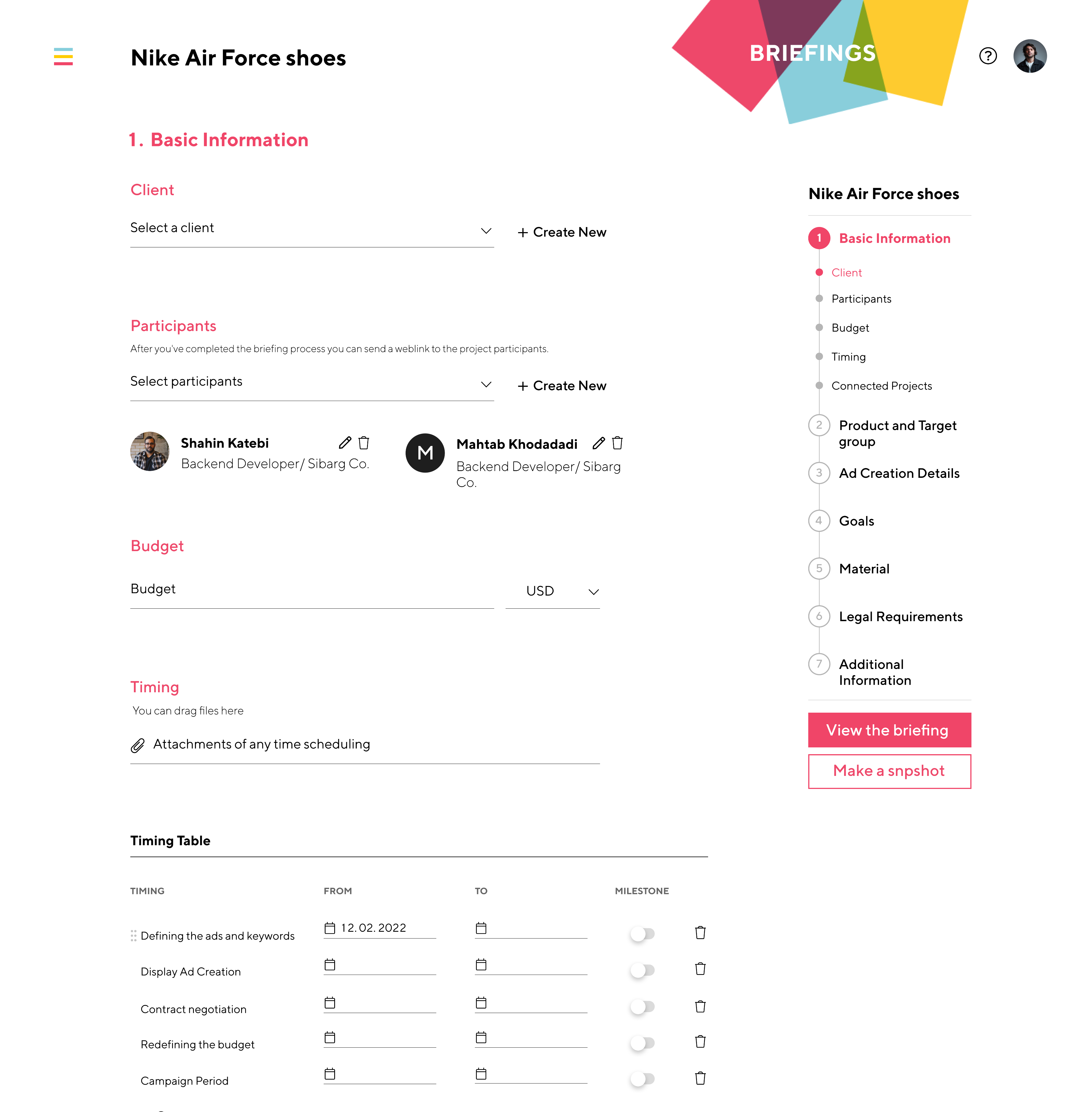
- Start strong: Templates & quick access
- A redesigned “Create a briefing” area surfaces frequently used templates (e.g., Website, Web Design, Shop, UX brief, Content brief).Impact: Reduces decision time, encodes best practices, and lowers cognitive load.
- Collaboration is first-class
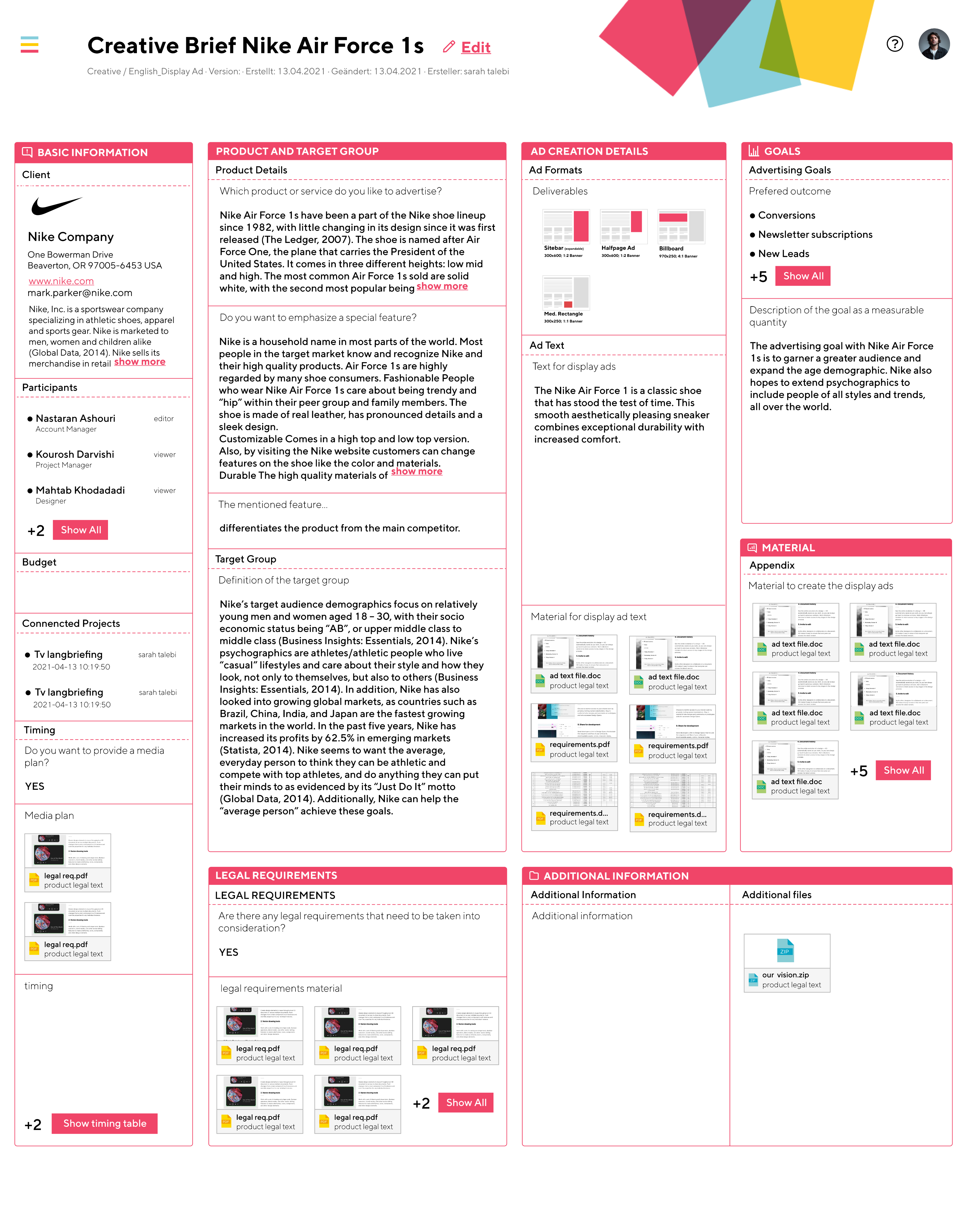
- Participants are added early, with clear roles and a weblink for sharing once the briefing is complete. A right-side stepper makes progress obvious (Timing → Product/Target Group → Ad Details → Goals → Material → Legal → Additional Info).Impact: Fewer drop-offs, clearer ownership, faster reviews.
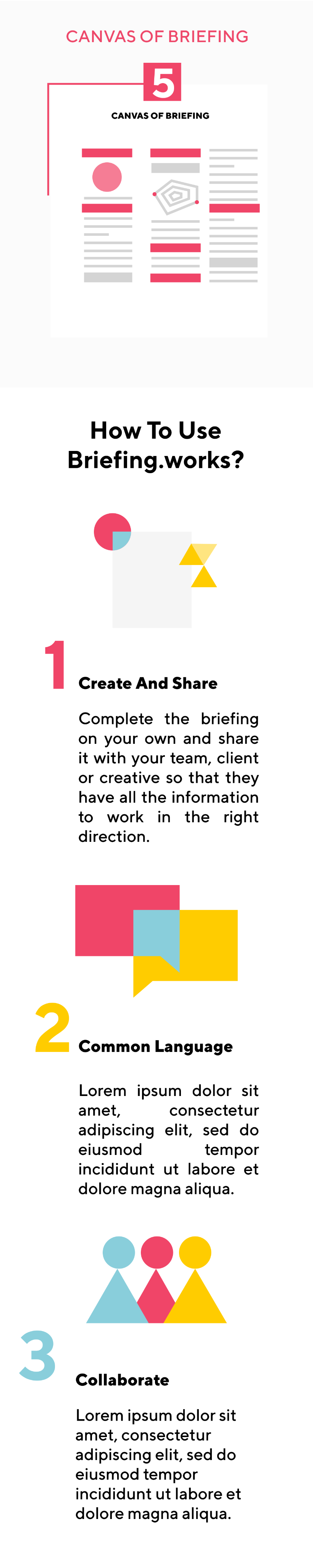
- Canvas view for alignment
- Briefings render into a structured, shareable Canvas—a one-page artifact ready for client meetings and approvals.Impact: Faster alignment and cleaner hand-offs between teams.
- Export & integrations with project management tools
- One-click export turns an approved briefing into an executable project in tools like Asana (and similar tools such as Jira, Trello, ClickUp).
- Field mapping: Sections of the briefing become tasks/subtasks; Participants map to assignees; Timing maps to due dates and milestones.
- Context preserved: Attachments and key details travel with tasks; each task includes a deep link back to the Canvas.
- Safe setup: A short “Choose tool → Select workspace/project → Map fields → Preview & create” flow prevents surprises and keeps permissions explicit.Impact: Eliminates manual re-entry, speeds kickoff, and keeps execution aligned with the approved brief.
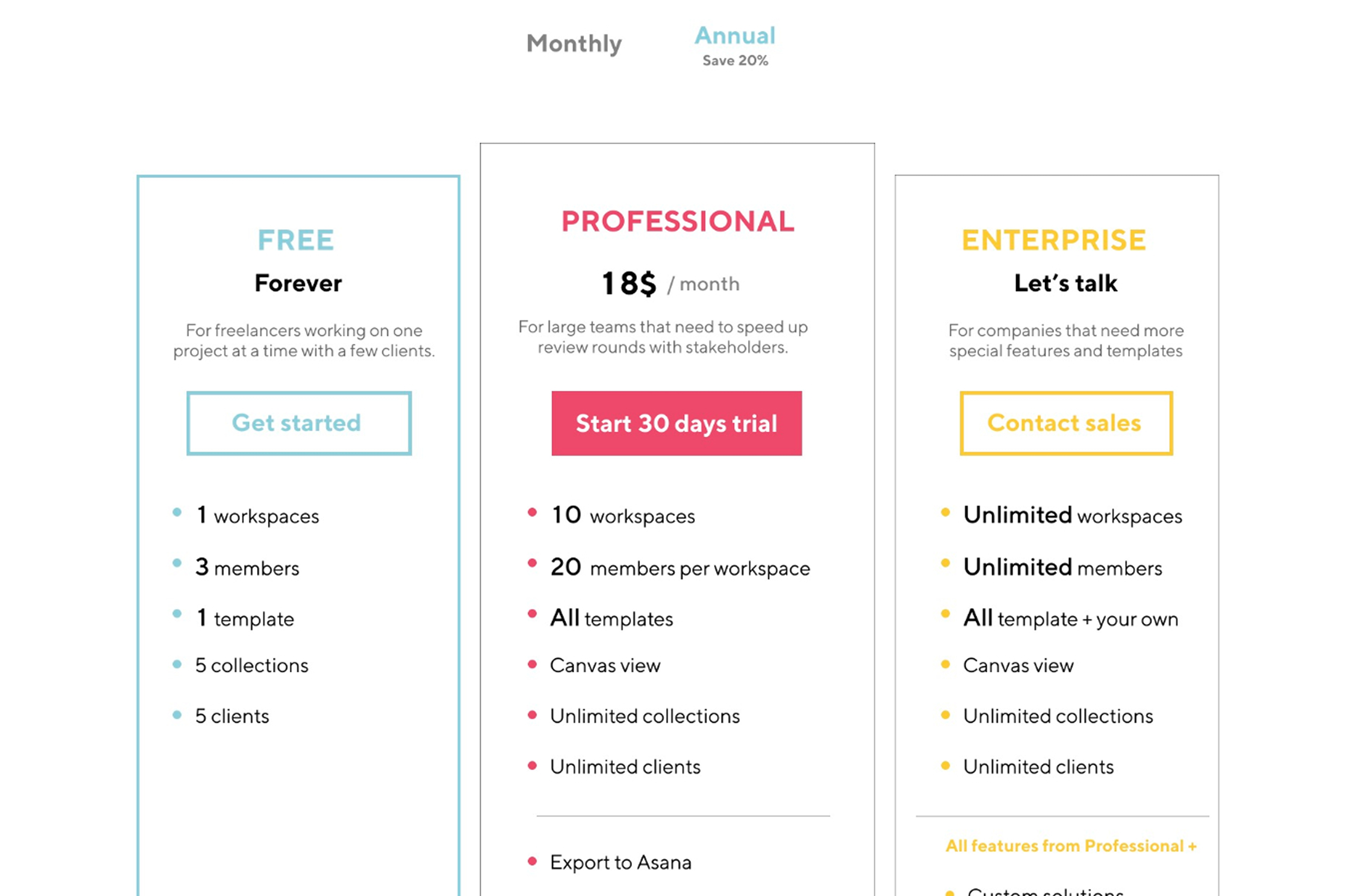
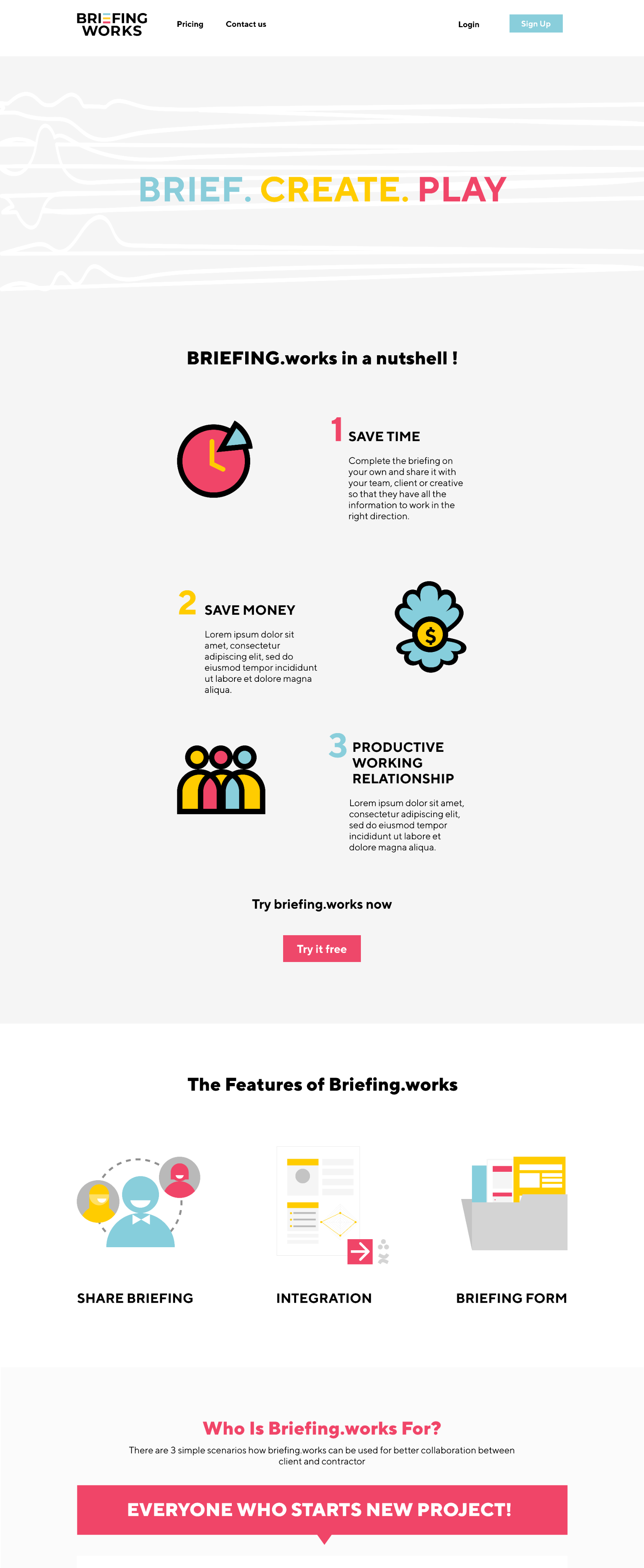
Marketing website & subscription flow
Designed the public site (mobile + web) to introduce value, features, pricing and convert.
- Structure: Home, How it works, Templates, Canvas, Pricing, Resources
- Conversion: clear CTAs (“Create a briefing”, “Try the Canvas”), email capture, free-trial signup, and checkout
- Trust: social proof, template previews, componentized feature blocks for reuse
- Performance & basics: lean assets, accessible color/contrast, semantic structureImpact: Clear story from problem → solution → proof → signup; reduced friction to subscribe.
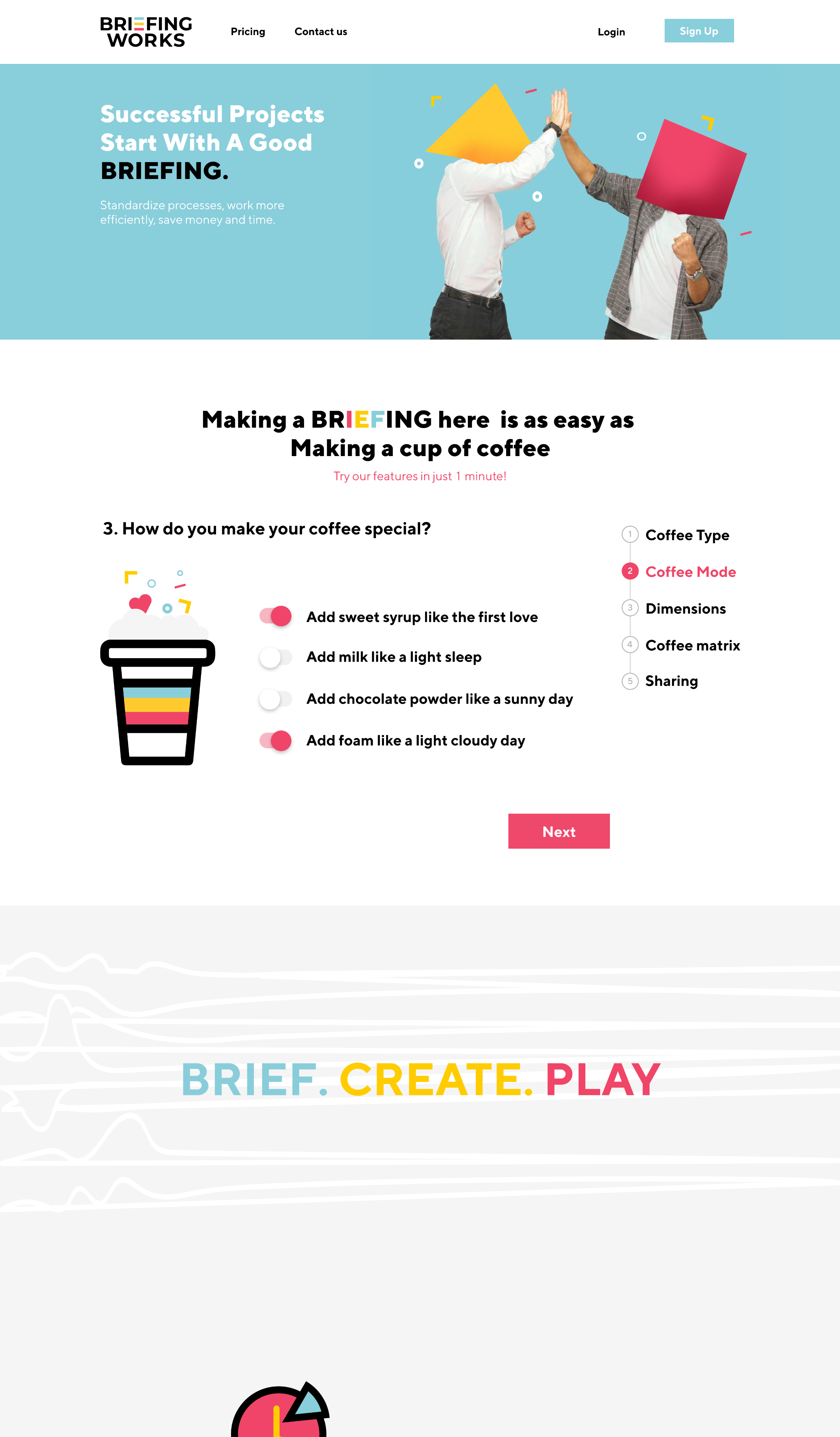
A playful, 60-second interaction on the homepage: visitors “order a coffee” by selecting beans, size, milk, and extras—each mapped to briefing inputs (goals, audience, constraints) and instantly rendered as a mini Canvas.
- Purpose: demo the product’s value without commitment; teach the mental model “inputs → Canvas”
- Flow: Pick ingredients → see the brief populate → view the live Canvas card → CTA “Start your real briefing”Impact: Higher engagement on first visit and more clicks into “Create a briefing.”
Outcome
- Simplified briefing creation, reducing confusion and errors
- Improved consistency via a reusable design system
- Smoother onboarding through clearer steps and terminology
- Export + integrations for real-world execution
- Responsive website that explains the product and converts with a subscription flow
- Gamified home that demonstrates value and drives exploration(Quant metrics are confidential; internal signals and stakeholder feedback indicated smoother completion, fewer blocked states, and stronger website engagement.)